Client
Rapid Transit
Services
Branding
Year
2024
Credits
Yousaf S (Designer)
Infos
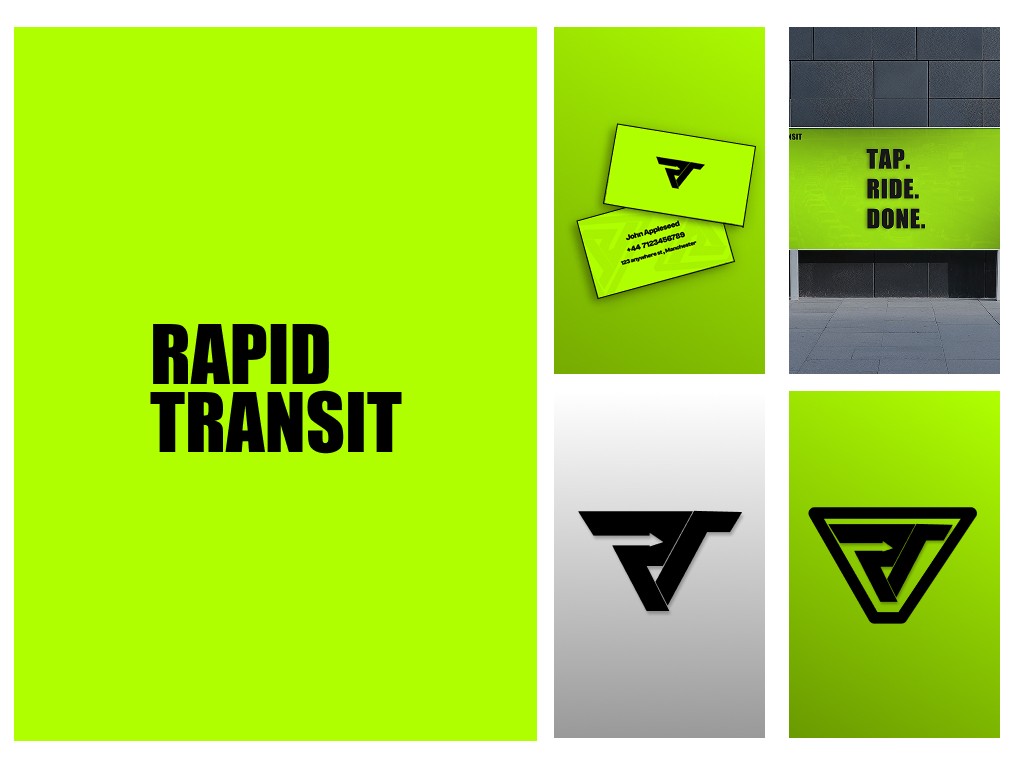
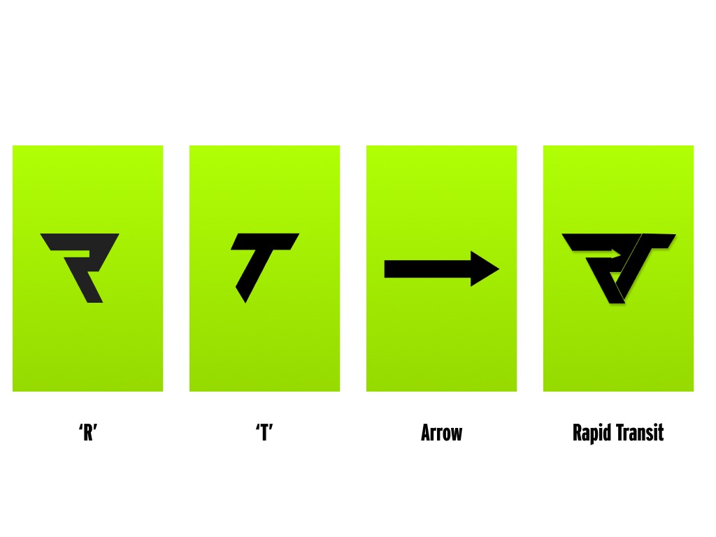
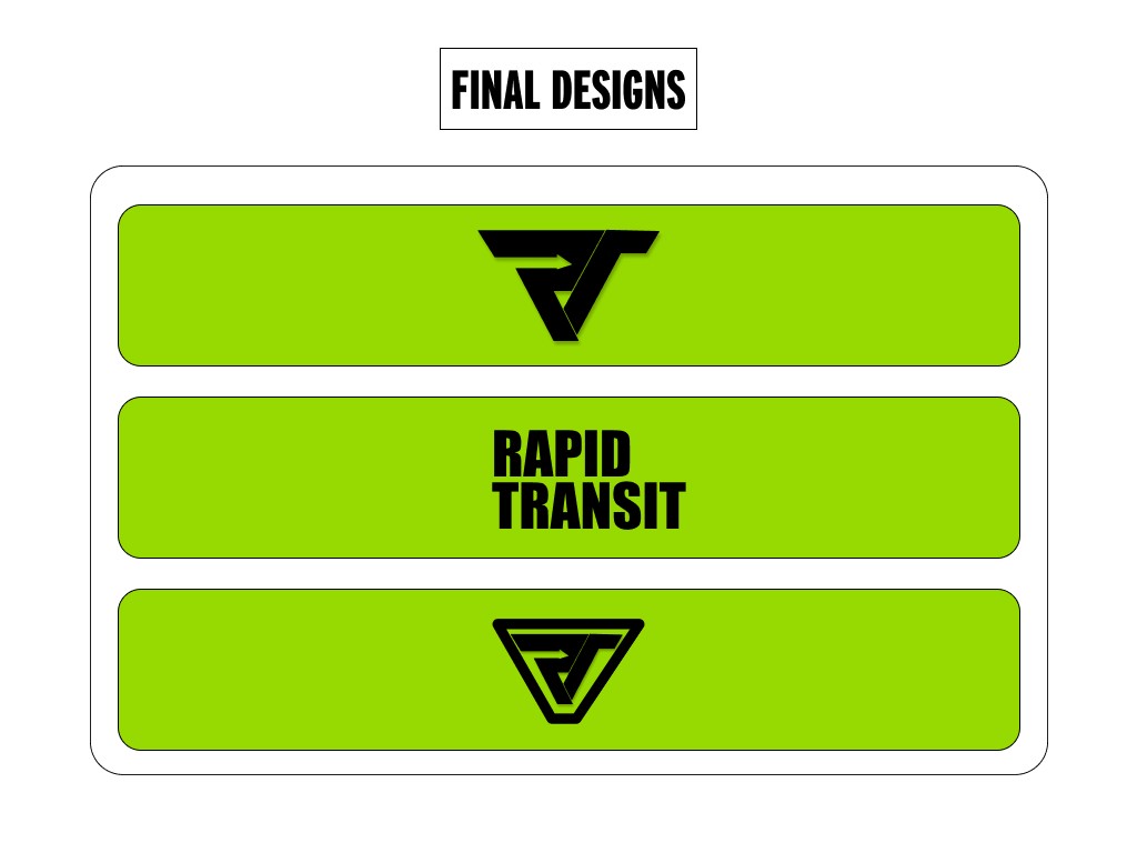
Rapid Transit — Brand Identity Concept Rapid Transit is a ride-hailing startup aiming to disrupt the market with a faster, more intuitive travel experience. The client wanted something that visually captured the essence of speed, movement, and modern transport—without falling into the generic “Uber clone” trap. The design challenge was to create a clean, minimalistic logo that merges the letters R and T into a cohesive symbol, while also subtly embedding an arrow to represent motion and forward-thinking. I focused on crafting a mark that could stand alone across digital and physical platforms—from app icons to vehicle decals. The merged R/T symbol uses strong, sharp lines to imply acceleration, while the integrated arrow adds a hidden layer of storytelling, reinforcing the idea of purposeful travel.